The Impact of Colour Psychology in Commercial Painting: Creating the Right Atmosphere
In the world of commercial painting, colour holds significant power in shaping the atmosphere of a space and influencing customer behaviour. By understanding the principles of colour psychology, commercial painting contractors can strategically utilize colours to enhance brand image, elevate customer experience, and drive business growth. Let’s explore how the thoughtful application of colour can create the desired ambiance and impact in commercial spaces.
Choosing Colours for Commercial Spaces:
When embarking on a commercial painting project, careful consideration must be given to the choice of colours. Different colours evoke specific emotional responses and can set the tone for a space. Here are two primary categories to consider:
Warm Colours: Energize and Excite
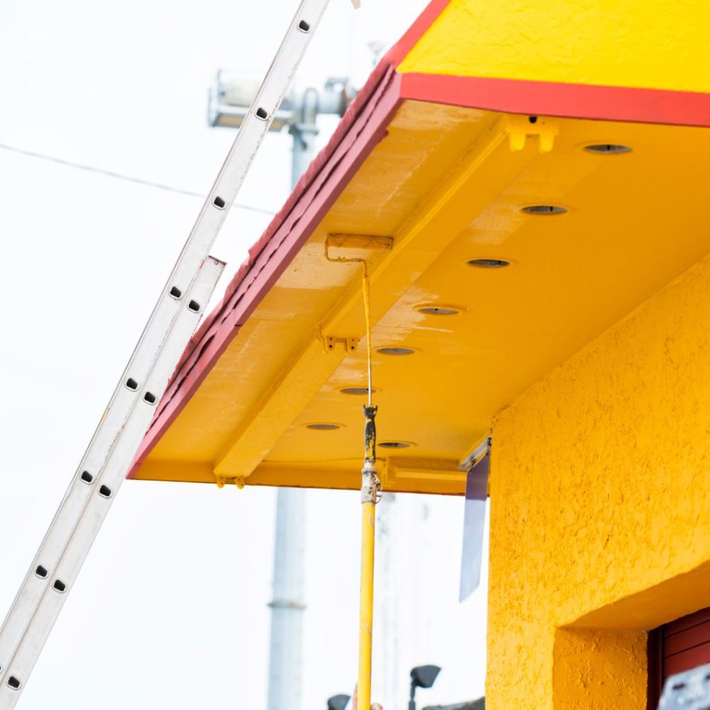
Warm colours, such as red, orange, and yellow, are known to stimulate energy, excitement, and positivity. These vibrant hues can be particularly effective in spaces where a lively and engaging atmosphere is desired. Fast-food chains and entertainment venues often employ warm colours to stimulate appetite and create a sense of vibrancy.
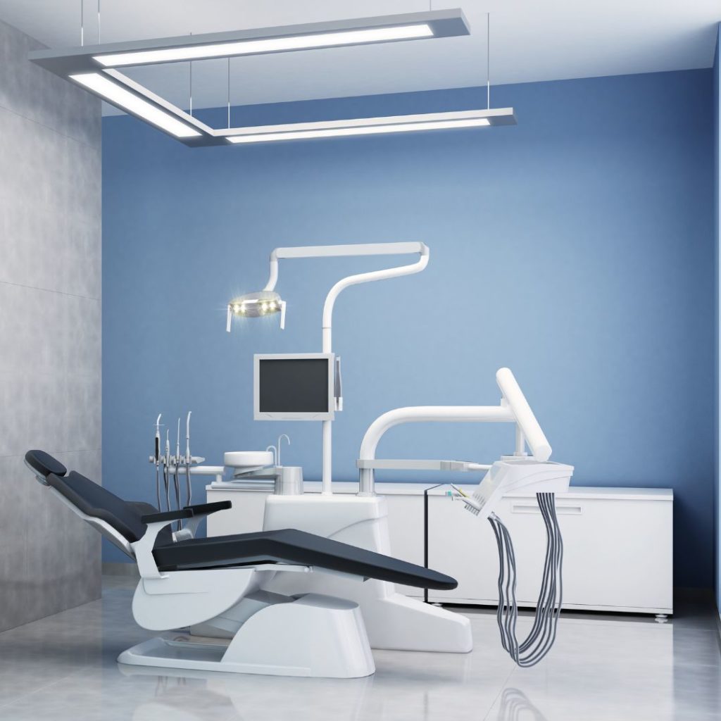
Cool Colours: Calm and Reliable
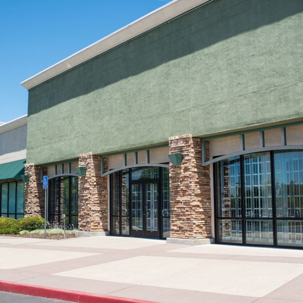
Cool colours, such as blue, green, and purple, evoke a sense of calmness, tranquility, and reliability. These colours are often found in healthcare facilities, financial institutions, and corporate environments, where creating a serene and trustworthy ambiance is crucial.
Aligning with Brand Identity:
In addition to considering emotional responses, it’s essential to align the chosen colour scheme with the brand identity and target audience. Here are a couple of examples:
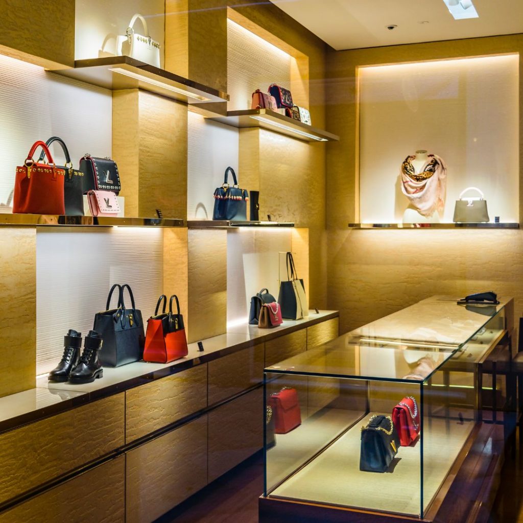
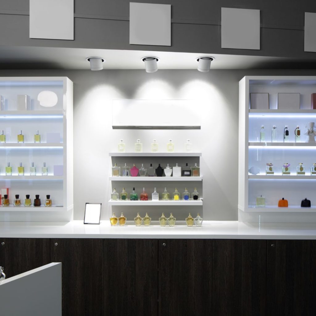
Sophistication and Exclusivity
For high-end fashion boutiques or luxury establishments, a sophisticated palette consisting of deep blues, regal purples, and elegant metallic tones can convey a sense of elegance and exclusivity. These colours create a visually striking and upscale environment that resonates with the brand’s identity.
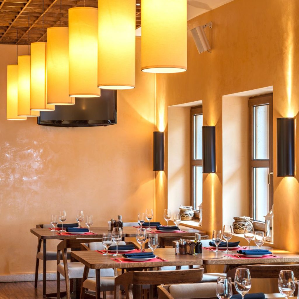
Welcoming and Comfortable
Family-friendly restaurants or cozy cafes benefit from warm, inviting colours like earthy browns and soft oranges. These colours evoke feelings of warmth, comfort, and familiarity, creating an atmosphere that invites customers to relax and enjoy their dining experience.
Influencing Consumer Behaviour:
Colours can also be strategically used to influence customer behaviour and guide their attention within a space. Here are a couple of tactics:
Directing Attention
By employing vibrant accent colours or lighting techniques, commercial spaces can draw attention to specific areas or products. This strategy can be used to highlight promotions or featured products, increasing their visibility and potential sales.
Creating a Relaxing Environment
In waiting areas or spaces where customers may experience anxiety or stress, incorporating calming colours can help create a more serene and tranquil atmosphere. Soft blues, muted greens, or soothing neutrals can help reduce tension and enhance relaxation.
Consideration for Cultural Differences:
It’s important to note that colours can hold different meanings and associations across various cultures. To ensure that the colour choices resonate with the local audience, commercial painting contractors operating in diverse markets should conduct thorough research to adapt the colour palettes accordingly.
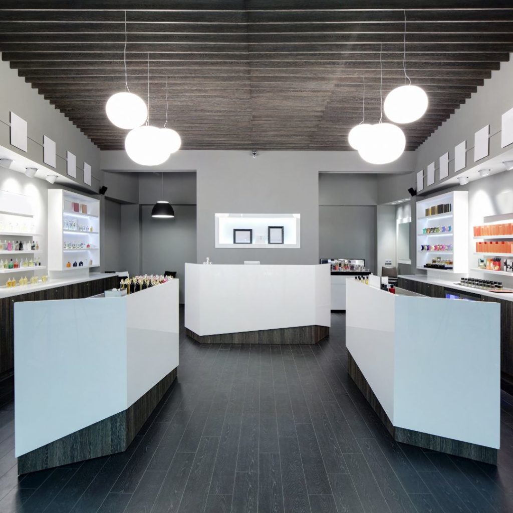
Importance of Lighting:
Lighting plays a vital role in colour perception and can significantly impact the overall ambiance of a space. The intensity, temperature, and direction of light can influence how colours are perceived and experienced. By integrating different lighting options such as task lighting, ambient lighting, and accent lighting, businesses can create dynamic and versatile spaces that cater to different needs and moods.
Practical Considerations:
While colour psychology is paramount, practical considerations are equally important when selecting colours for commercial spaces. Factors such as durability, maintenance requirements, and brand consistency must be taken into account to ensure long-lasting and visually cohesive results.
Conclusion:
By understanding the impact of colour psychology in commercial painting, businesses can harness the power of colours to create the desired atmosphere, influence customer behaviour, and strengthen their brand image. Commercial painting contractors, such as Remdal, bring expertise in colour psychology and professional painting services to help businesses transform their commercial spaces into captivating environments that leave a lasting impression on customers.
For all your commercial painting needs in Vancouver, trust Remdal, one of the region’s leading commercial painting contractors. Contact us today to discuss how our expertise in colour psychology can help create the right atmosphere and elevate your commercial space. Let us transform your vision into a vibrant reality.